Black Friday and Cyber Monday (BFCM) are the biggest shopping events of the year. In 2025, Black Friday falls on Novem ber 29 and Cyber Monday on December 2. For online retailers, this means one thing—competition for attention is fiercer than ever.
Shoppers will be drowning in promotional emails, flash sales, and last-minute offers. To stand out, your Black Friday email design needs to be clean, compelling, and conversion-focused. Even small mistakes in design or layout can cause shoppers to ignore your message, delete your email, or—even worse—unsubscribe.
To make sure your campaigns deliver results, let’s look at five common email design mistakes that can kill your BFCM conversions and how to avoid them.
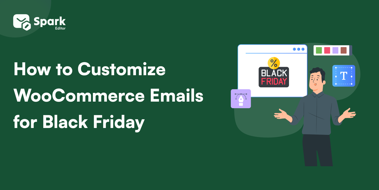
Create eye-catching Black Friday emails that drive results with Spark Editor. Customize layouts, test designs, and increase engagement.
How to Test and Improve Your Black Friday Email Design
Even if your design looks flawless, don’t assume it will perform perfectly. Run A/B tests on different elements—subject lines, button colors, banner styles, and even email length. For example, you could test “$20 Off All Orders” vs. “Save $20 + Free Shipping Over $50” to see which gets more clicks. Testing ensures that your Black Friday email design is not only visually appealing but also conversion-driven.
Building a Strong BFCM Email Sequence
One email isn’t enough to win Black Friday or Cyber Monday. Shoppers are busy comparing offers, so you need multiple touchpoints. Plan a sequence:
- Teaser emails a week before Black Friday.
- Early access offers for VIPs or loyal customers.
- Last-chance reminders with urgency-driven CTAs.
By combining design best practices with a strategic send schedule, your Black Friday email design will stay top of mind all weekend long.
Run A/B tests on different elements—subject lines, button colors, banner styles, and even email length by following our guide on how to test your WooCommerce emails.
Why Email Design Matters for Black Friday and Cyber Monday
Before diving into the most common mistakes, let’s set the stage. Black Friday and Cyber Monday are unlike any other shopping days of the year. Shoppers aren’t casually browsing—they’re actively hunting for the best deals in a sea of competing offers. That means your emails have just a few seconds to capture attention and drive action.
A well-structured Black Friday email design not only communicates your discounts but also reflects your brand’s professionalism and reliability. Poor design, on the other hand, creates friction. If your message looks cluttered, is unreadable on mobile, or lacks urgency, customers will scroll past your email and shop elsewhere.
That’s why avoiding design mistakes isn’t just about aesthetics—it’s about maximizing conversions during the most competitive sales weekend of the year. Let’s look at the mistakes you must avoid.
Top 5 BFCM Email Design Mistakes One Shouldn’t Overlook
Every year, Black Friday and Cyber Monday bring record-breaking sales opportunities—but also intense competition. With inboxes flooded by brands shouting about their biggest discounts, your emails must do more than just announce a deal. They need to grab attention instantly, look professional across devices, and guide customers directly to checkout.
This is where Black Friday email design becomes crucial. The way you structure your email—its layout, visuals, call-to-actions, and urgency signals—can make the difference between a sale and a lost customer. Even the best offers will fail if poor design keeps shoppers from seeing them.
To help you avoid costly mistakes, let’s explore five (plus more) design errors that could seriously hurt your BFCM conversions—and how to fix them before the holiday rush begins.
Mistake #1: Overloading Emails with Too Much Content
During BFCM, customers don’t have the time or patience to scroll through long-winded emails filled with product grids, multiple banners, and heavy text. An overloaded email doesn’t just confuse readers, it actively drives them away.
Shoppers want one thing: to see your deal quickly and clearly. If they have to search for your discount in a sea of content, you’ll lose them.
Example of what not to do:
A long email starting with three paragraphs about your brand story, followed by 15 product thumbnails, two collages, and a discount buried at the bottom.
Better approach:
Start with a short, bold headline:
“Black Friday Deal: $20 Off All Orders + Free Shipping Over $50”
Then follow it with one strong hero image and a visible call-to-action (CTA).
Pro Tip: Use the “3-second rule.” If customers can’t understand your offer in the first 3 seconds of opening your email, it’s too long or cluttered.
Store Owner Questions:
- How much text is too much for a BFCM email?
- Can my customers identify my discount without scrolling?
- Does my email get to the point in fewer than 50 words?
If you’re not sure how much content is “just right,” check out our guide on 15 Ecommerce Email Marketing Tips for 2025. It shares practical tips on writing copy that engages without overwhelming.
Mistake #2: Ignoring Mobile Optimization
Over 70% of emails during the holiday season are opened on mobile devices. That means your beautiful desktop design might look broken or unreadable on a phone screen. If your Black Friday email design isn’t mobile-friendly, you risk losing a majority of your audience.
Example of what not to do:
A two-column product layout that looks perfect on desktop but shrinks on mobile—making text tiny and CTA buttons impossible to tap.
Better approach:
- Use single-column layouts so content flows smoothly on mobile.
- Add large, thumb-friendly buttons like “Shop Now” that are easy to tap.
- Choose fonts that remain legible at smaller sizes (16px minimum for body text)
Pro Tip: Always test your email on multiple devices (iPhone, Android, tablets) before sending. A broken design can instantly kill conversions.
Store Owner Questions:
- Does my email look just as good on mobile as on desktop?
- Are my CTAs big enough to tap with one thumb?
- Is my font size readable without zooming in?
Responsive design is key, and this applies not only to holiday campaigns but to all store emails. Our resource on Best Practices for Creating High-Impact Responsive WooCommerce Emails will help you make sure your layouts shine .
Mistake #3: Weak or Hidden Call-to-Action (CTA)
Your CTA is the bridge between interest and purchase. If it’s buried, too small, or blends into the background, you’re leaving money on the table.
During BFCM, shoppers skim emails. They don’t have time to hunt for your button. A strong CTA must be obvious, clickable, and persuasive.
Example of what not to do:
A faint gray text link at the bottom of your email that says “Shop Deals.”
Better approach:
- Use bold, high-contrast buttons. For example: Black button + white text → “Shop the Sale.”
- Place your main CTA “above the fold” (visible without scrolling).
- Repeat your CTA at least once more at the end of the email for skimmers.
Pro Tip: Action words convert better. Use copy like “Claim Your $20 Off” or “Unlock Free Shipping” instead of the generic “Click Here.”
Store Owner Questions:
- Is my main CTA visible without scrolling?
- Does my CTA stand out from the rest of the design?
- Am I repeating my CTA for readers who skim?
Mistake #4: Overusing Images Without Alt Text
Yes, visuals are essential to Black Friday email design, but relying solely on images is risky. Many inboxes block images by default, and if your email is just one big graphic, customers may see a blank page.
Example of what not to do:
Sending an image-only flyer that says “Cyber Monday 50% Off” with no supporting text.
Better approach:
- Use a mix of HTML text and images.
- Always include descriptive alt text so your message still gets across if images are blocked. For example:
- Alt text: “Black Friday – Save $20 + Free Shipping Over $50.”
- Keep file sizes light so emails load quickly, even on slower mobile networks.
Pro Tip: Make sure at least your discount and CTA appear as live text—not just in images—so they’re always visible.
Store Owner Questions:
- If my images don’t load, does my email still make sense?
- Have I added alt text to every promotional image?
- Are my discounts visible even in plain text?
Struggling with layouts that balance visuals and text? Our blog on the importance of WooCommerce email design dives deeper into why design balance matters for readability, accessibility, and conversions.
Mistake #5: Forgetting Urgency and Scarcity
BFCM is fueled by urgency in a way that customers know deals won’t last. If your Black Friday email design doesn’t make that urgency crystal clear, shoppers will procrastinate and you’ll lose conversions.
Example of what not to do:
A simple “Shop Deals” email without any deadlines, countdowns, or limited stock mentions.
Better approach:
- Add countdown timers for flash sales.
- Use phrases like “Ends Midnight” or “Only 50 Left in Stock.”
- Highlight urgency in CTAs: “Shop Before It’s Gone” vs. plain “Shop Now.”
Pro Tip: Pair urgency with clarity. Don’t just say “limited time”—specify exactly when the deal ends.
Store Owner Questions:
- Does my email clearly communicate a deadline?
- Am I using design elements (timers, bold fonts) to show urgency?
- Would my reader feel the need to act immediately after opening?
Urgency isn’t just for BFCM—it’s a year-round driver of sales. To maximize results, see how can custom WooCommerce order emails can boost your sales. for tips on designing transactional emails .
Boost your Black Friday sales with Spark Editor; easily customize emails, test layouts, and maximize engagement this BFCM!
Final Takeaway
Your Black Friday email design can be the difference between record-breaking sales and missed opportunities. To recap:
- Keep content short and focused—don’t overload.
- Make mobile optimization non-negotiable.
- Use strong, obvious CTAs that drive clicks.
- Balance visuals with text and always add alt text.
- Create urgency with deadlines, timers, and scarcity cues.
During Black Friday and Cyber Monday, every second counts. Customers are scrolling quickly, comparing deals, and deciding instantly. A well-structured, mobile-first email that’s clear, bold, and urgent will capture attention and drive conversions.
This year, don’t let small design mistakes cost you big. Plan your Black Friday email design carefully, test across devices, and put yourself in the customer’s shoes. Your conversions will thank you.
Other Helpful Reads
Frequently Asked Questions
How early should I start planning my Black Friday email design? Ideally, you should start planning in September or early October. This gives enough time to design, test, and schedule campaigns before the holiday rush.
How many emails should I send during BFCM? A single email isn’t enough. Aim for a sequence: teaser emails, early access offers, launch-day emails, and last-chance reminders. Typically, 4–6 emails across Black Friday and Cyber Monday perform well.
What’s the best length for a Black Friday email? Keep it short and scannable. Around 50–125 words with one hero image, a clear discount, and a strong CTA works best. If your email requires more detail, break it into sections with clear headings.
Should I design separate emails for Black Friday and Cyber Monday? Yes. While deals may overlap, treat them as separate campaigns. Black Friday emails should create excitement, while Cyber Monday emails can focus on “last chance” urgency or online-exclusive deals.
How do I make my Black Friday email design stand out? Use bold headlines, contrasting CTA buttons, and urgency-driven visuals like timers. Personalization also helps—recommend products based on customer history instead of sending the same template to everyone.